Service History calendar changes
New Features:
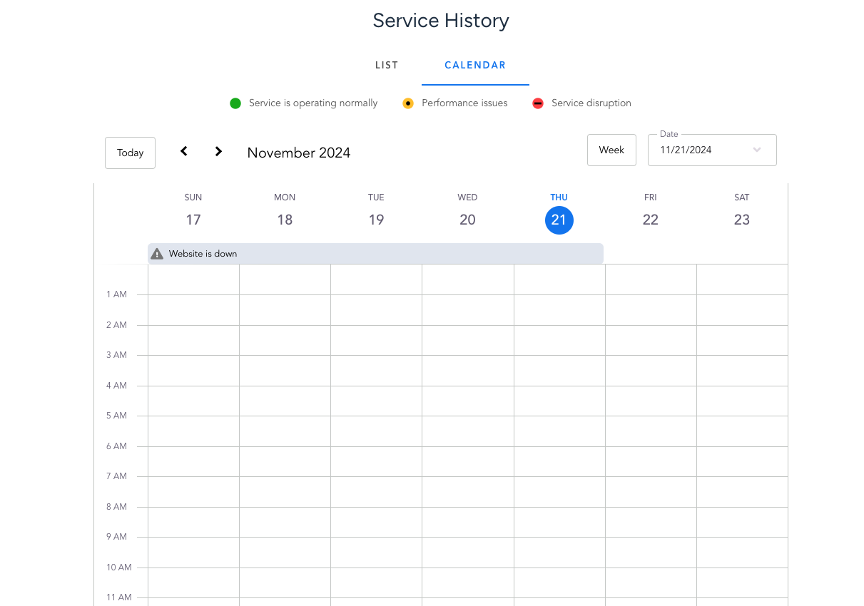
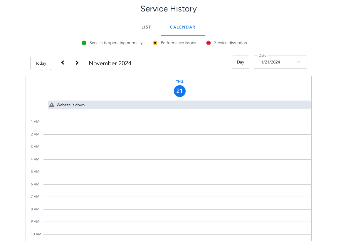
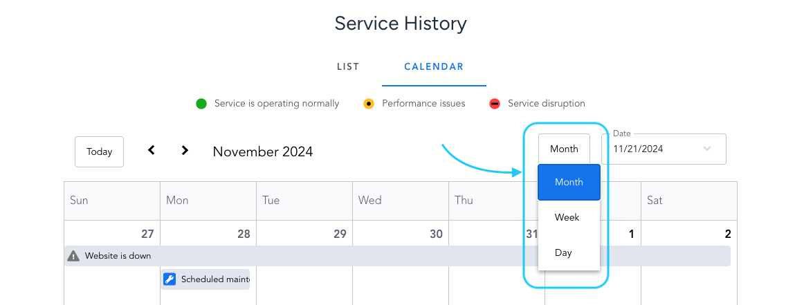
1. Weekly and Daily Views in Calendar for Service History
We’ve expanded the functionality of the calendar view. Previously, you could only check updates in the monthly layout. Now, you can easily switch between weekly and daily views, giving you more flexibility.
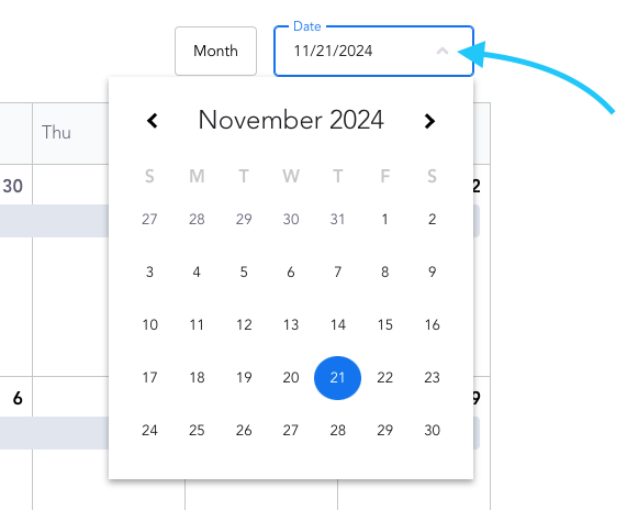
2. Day Picker
We’ve also added a day picker to the calendar view. This makes it easy to check service status updates for any specific day across the monthly, weekly, or daily view.
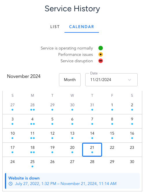
3. Improved Calendar View for Small Screens
The calendar view has also been optimized for smaller screens, ensuring a more user-friendly experience.
Updates
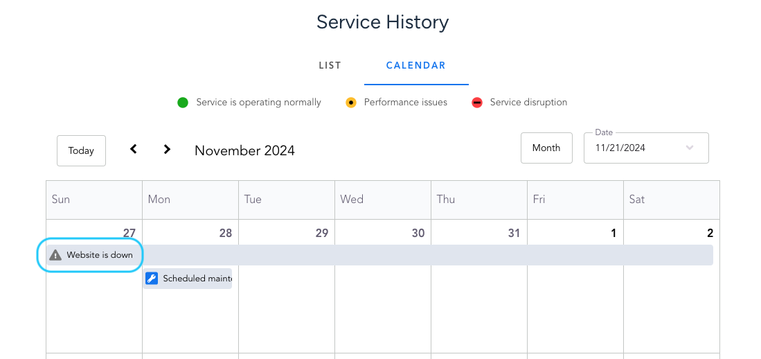
1. Event Titles Now Displayed in Calendar
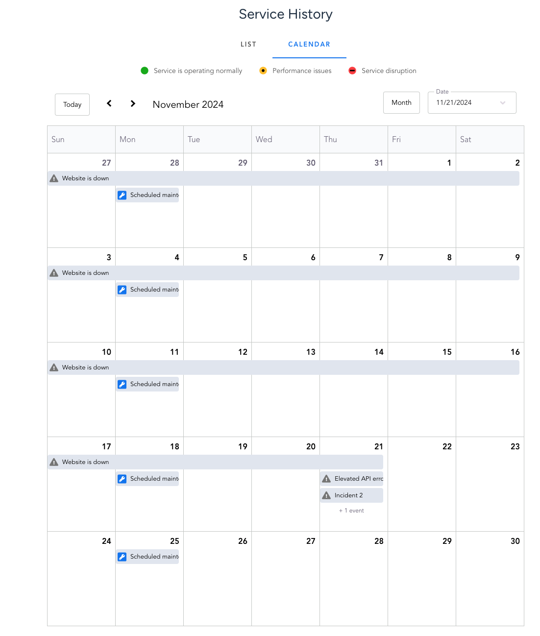
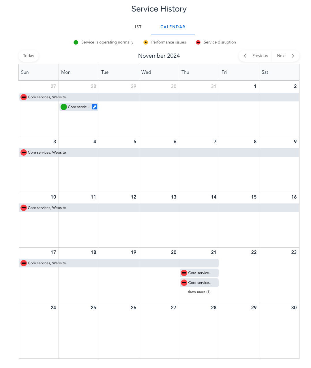
We’ve updated the calendar to display event titles instead of service names for the events. This provides more precise information at a glance.
Below is an example showcasing the change.
Previous Version: The calendar showed the service name, such as "Core services, Website."
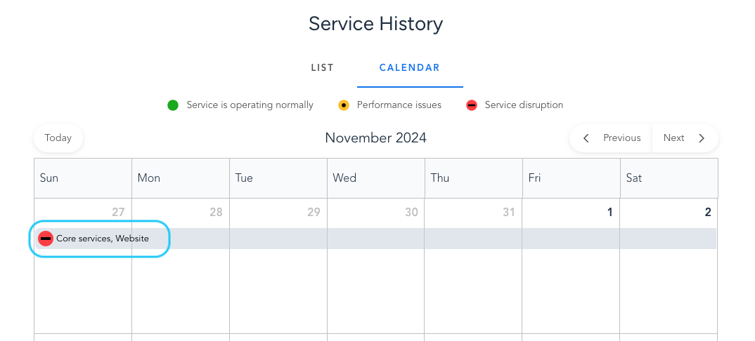
New Version: The event now shows the incident name (event title), such as "Website is down."
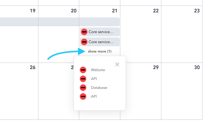
2. Improved Event Navigation for Busy Days
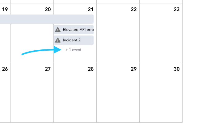
When there are more than three events on a single day, the "Show More" tooltip is now replaced with a Switch to Day View, which provides a more organized view of events.
3. Event Details Now Displayed in Tooltip
Clicking on an event will now show the event details in a tooltip instead of opening the event page in a new tab, providing a more streamlined and efficient experience.
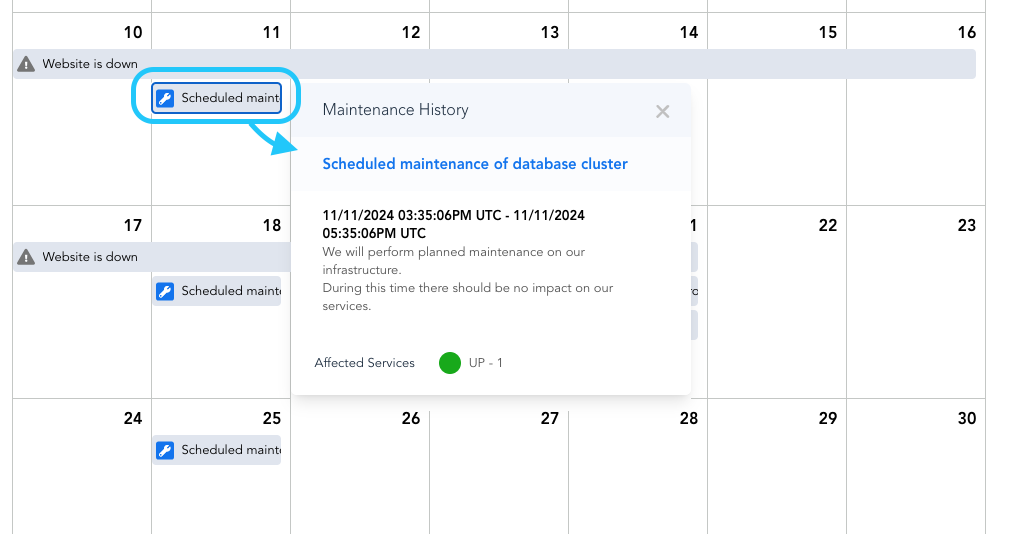
4. Improved calendar appearance
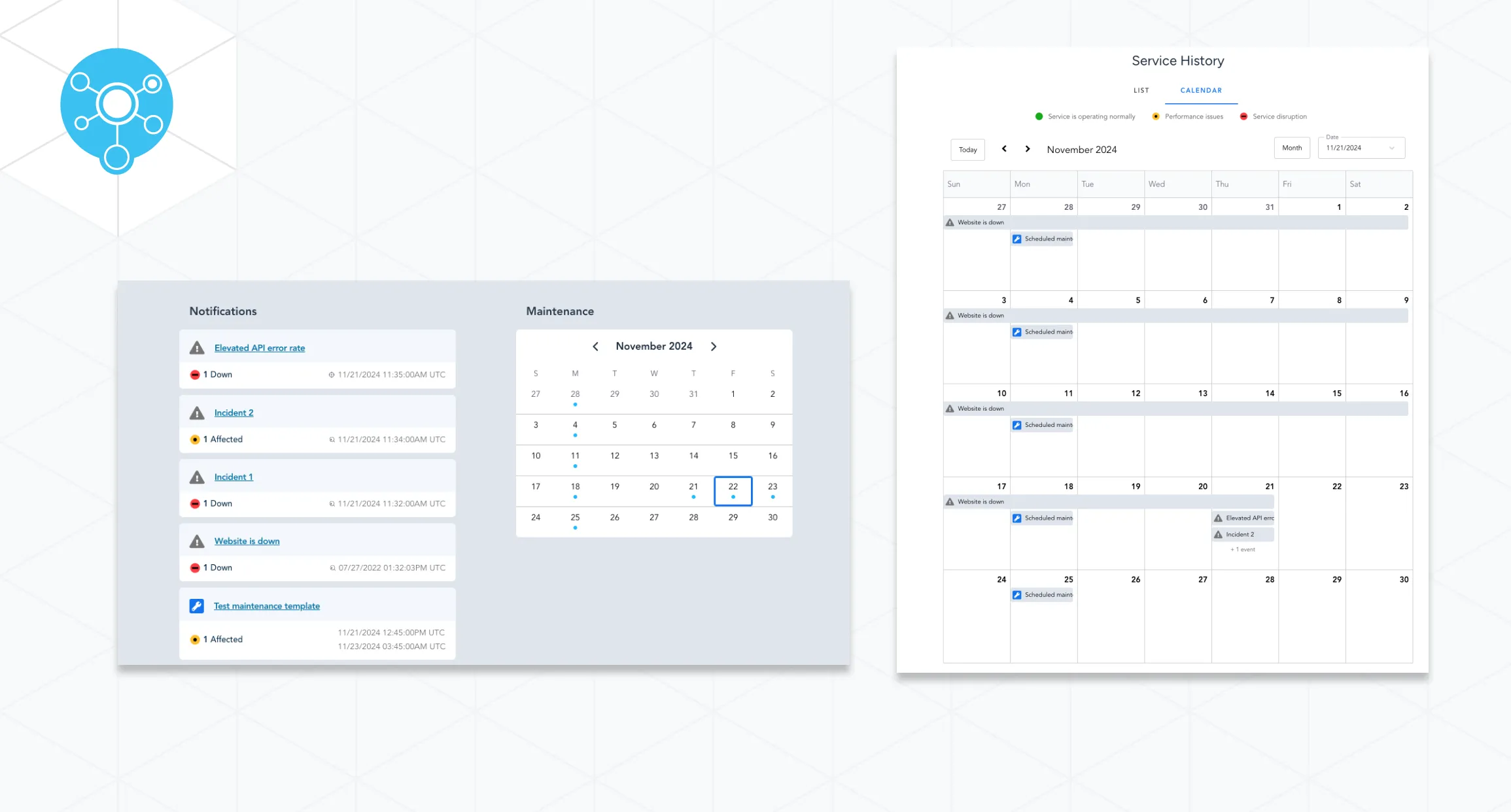
We’ve improved the calendar's overall look by creating a cleaner, more intuitive design. Additionally, the icons now represent the type of an event rather than its status, making it easier to identify different events at a glance. Below is the before and after look:
Planned events calendar changes
Updates
1. Improved Navigation for Planned Events Calendar
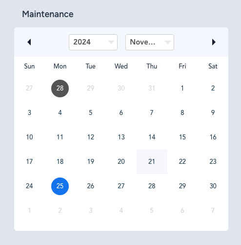
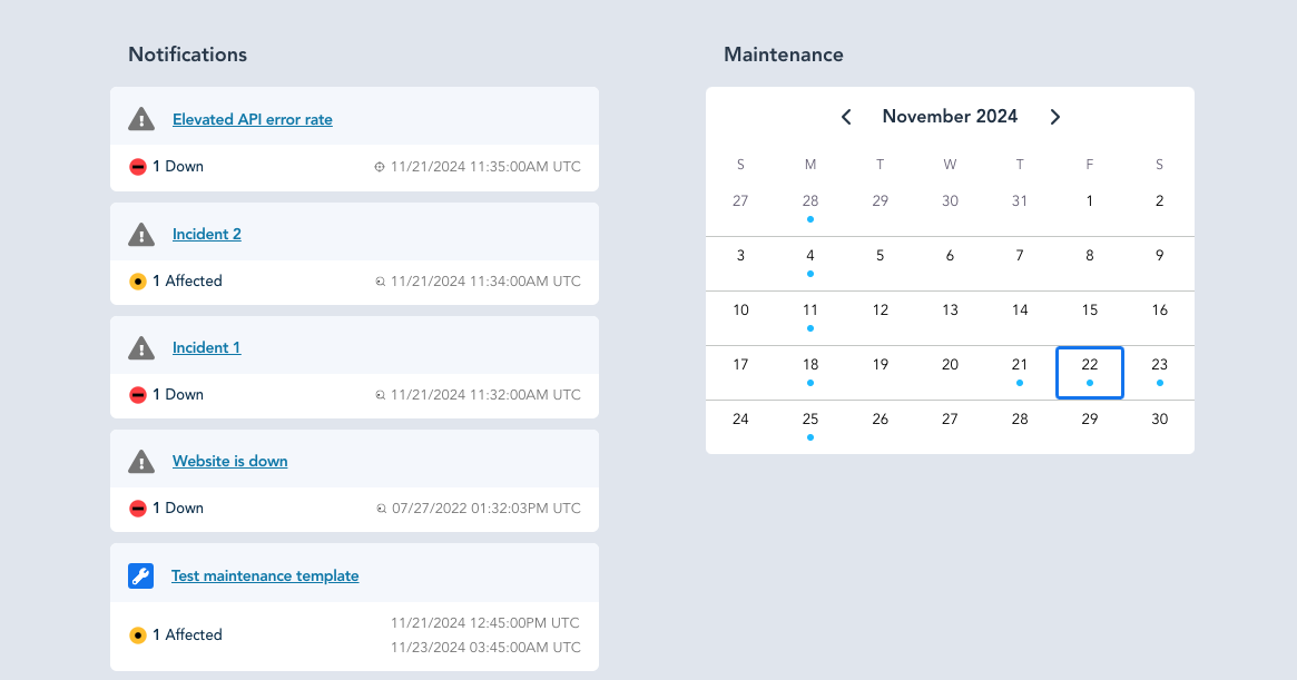
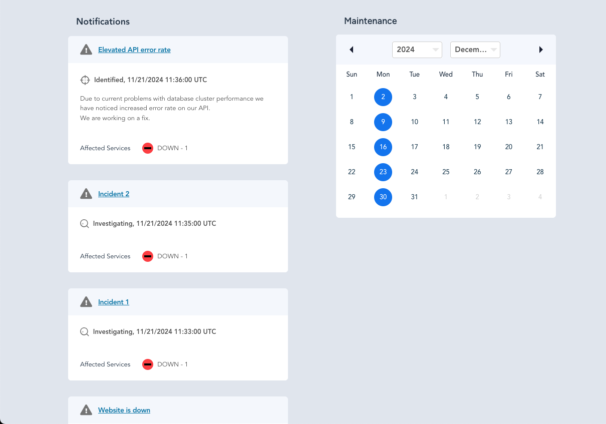
In the Planned Events calendar, we've removed the dropdowns for selecting the year and month and replaced them with buttons (arrows), allowing you to easily switch to the previous or next month with a single click for a cleaner look. Below is a comparison of the before and after:
2. Updated Event Preview
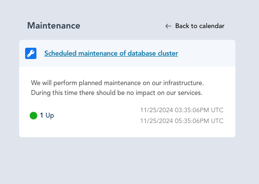
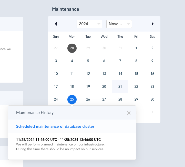
Clicking on an event now switches to the event card view instead of showing a tooltip, providing a cleaner view of the event information. Below is a comparison of the before and after:
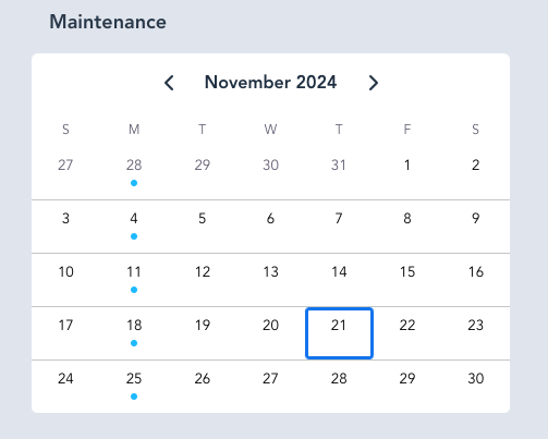
3. Enhanced Appearance of Planned Events Calendar
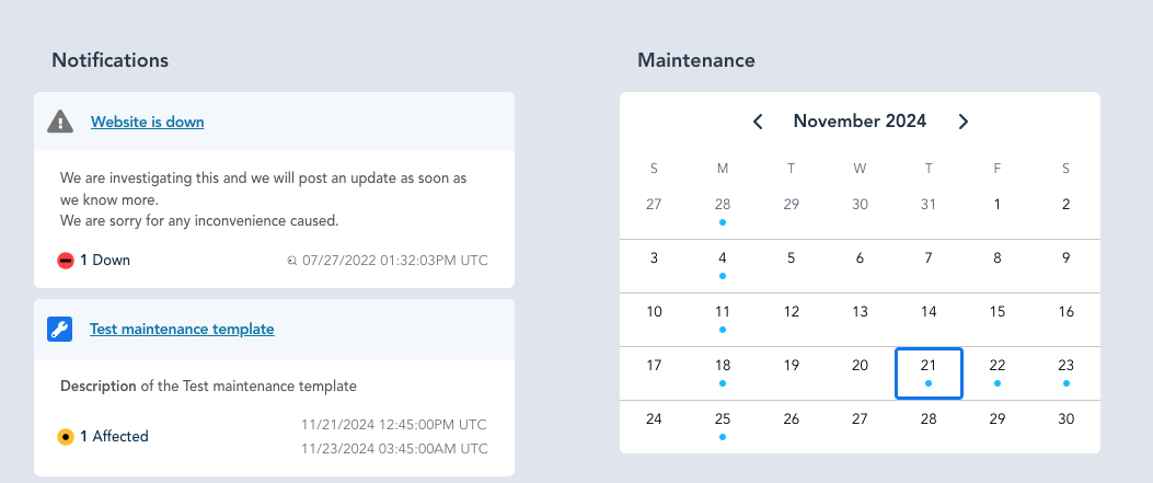
The overall appearance of the Planned Events Calendar has been updated. The colors and shapes have been improved, and events are now displayed as dots instead of the previous colored day markers for a cleaner and more modern look.
Event cards change
New feature
Dynamic Event Card Layout
We’ve introduced a new feature that adjusts the event card layout based on the number of visible events.
Previously, all event cards had a fixed height, which wasn’t ideal when there were too many events, as you had to scroll through a long list to view them all or to access the history calendar. Now, the layout dynamically changes for the number of events, improving both navigation and the overall user experience.
Update
Improved Event Card Appearance
The overall appearance of event cards in the notifications section has been improved for a cleaner look.
If you have any questions or feedback, please contact us.
