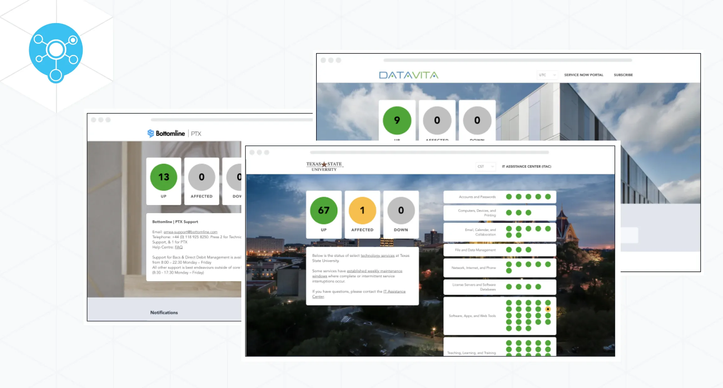
There isn’t a company in existence that wants to deliver bad news to customers when downtime happens. Unfortunately, systems break and sometimes you’re caught in a situation that forces you to do just that, and one of the most reliable ways you can do this is with status pages. A well-designed status page is an effective way to deliver bad news, providing a solution that keeps customers informed and reassured.
What is the Purpose of the Status Page?
The purpose of a status page is to clearly communicate incidents, downtimes, and scheduled maintenance with end-users. This proactive approach helps to avoid confusion and maintain a clear and concise conversation with your customers.
Because of this, companies have the option to use status pages to deliver “bad news” to customers in their incident management process. Some companies, however, don’t understand how to do this properly, and end up confusing end-users instead of informing them. Using a well-thought-out strategy, companies can prevent misunderstandings and keep the customer informed about the situation.
In this article, we’re exploring how status pages can help you deliver bad news to customers in a “good way,” starting with the psychology of news delivery and how you can use this knowledge for future incidents.
The Psychology of Delivering Bad News to Customers
The phrase “shoot the messenger” still stands true today. People don’t want to receive bad news. This mindset certainly doesn’t change when you’re operating a business and communicating with your customers.
A recent report from Zendesk reports that “half of the customers say they would switch to a competitor after just one bad experience.” While some companies think this just relates to customer service, IT incident communication also supports a ton of responsibility for how users perceive businesses. So if your company is delivering bad news in a way that turns the customer away, you’re falling into a problem that’s unfortunately quite common.
As human beings, when we’re confronted with unexpected news that impacts us directly, we’re hardwired to confront the messenger. In some cases, we’re even expected to dislike the messenger, even if they’re not responsible for the negative situation.
When it comes to incident management, the analogy is no different. End-users expect information regarding negative circumstances to be communicated clearly, on time, and in an easily digestible manner. Employees must be trained to handle these difficult situations effectively.
There are a few specific methods that affect how an end-user digests new information. Color, voice and tone, and messaging can drastically affect how a consumer receives and processes news.
Using Color to Communicate Clearly
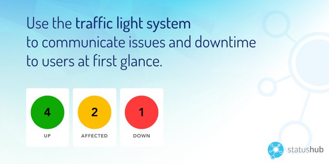
StatusHub uses a traffic light system to show the status of the services at the first glance. Similar to the usual traffic light the colours are green-yellow-red. Going back to the history of the traffic light let us explain the psychology of why these colours were chosen and why we in StatusHub use the same concept in status pages.
Red is the colour with the longest wavelength of any colour on the visible spectrum. That means that you can see it from the longest distance than any other colour. That is why red was used as a stop sign even before cars existed. Also, Moller et al. (2009) have shown that people tend to associate red with negative, danger-bearing emotions since it is the colour of fire, blood, anger, and sometimes of poisonous or dangerous animals. Yellow is second only to red in terms of visible wavelength. So it means “caution” because it is almost as easy to see as red. And green is after yellow on the visible spectrum.
In addition to that, an article from Digital Information World points out common psychological connections to certain colours. According to their research, the colour red is often associated with sensations of urgency. Yellow is often connected to caution. And green is associated with tranquillity.
Voice and Tone Matter
Another factor that affects how customers perceive bad news is voice and tone. A recent Forbes article defines brand voice as a tool that “revolves around what is being said and remains quite consistent with what is being delivered.” The same article defines brand tone as an element that focuses “specifically on the message that’s being conveyed and what it sounds like.”
For example, how is the company speaking to the end-user? Are they being direct and clear, or passive and muddled? Are they focusing on the customer or on themselves? The delivery of voice and tone matters for the customer whether they know it or not. When facing these issues, companies need to adjust by making their tone, voice and messaging as consistent and coherent as possible for end-users.
Without a tool to communicate “bad news” in a low-stress way, you risk losing trust and sacrificing a lot of hard-earned customer relationships. After all, they just want clear information on your incidents.
Now that we’ve introduced you to these common psychological triggers, let’s get into the specifics…
Why Status Pages are an Effective Way for Delivering “Bad News”
Status pages provide clarity and insight for end-users. When something goes wrong on your side of the fence, this is the most important informational tool you can show your end-users the moment they face the problem. Done well, they serve to keep them informed with clear, simple details. This is crucial advice for companies looking to maintain trust.
A good status page communicates data for incident management purposes. It tells customers when an issue is happening and when it will likely be resolved. It reassures through clear messaging that doesn’t leave room for doubt in the end-user’s mind.
Earlier, we mentioned how colour affects the end-user’s perception. StatusHub presents the status of services using a red/yellow/green traffic light system.

By using colour psychology to your advantage, a system like this taps into those emotions the consumer will identify with.
For clarification, the red traffic light means the service is down. The yellow light communicates that the service is affected. The green light represents services that are up.
The colours and messaging are clear so that no additional explanation is needed.
However, if the end-user does want more information, they can see the description of the outage below on the status page. It’s always helpful to pair visuals with clear messaging depending on how the end-user processes information.
Managing Incident Communication with Status Pages
Status pages also help IT teams to manage incident communication better and deliver “bad news” more appropriately. This proactive communication strategy ensures that customers know what to expect and when.
When downtime occurs, a company can use IT service status pages to make that clear to end-users while the tech team works on solving the problem without disruption. StatusHub’s software allows for users to subscribe for notifications from the status page so that they’re informed without having to return to the page every time to check. Users can also control notifications from their side of the platform. For example, they can reduce the number of received notifications by selecting the exact services they want to know about or choose to receive the minimum number of notifications per incident (typically first and final).
Since status pages are designed to communicate problems clearly (and with full transparency), customers will naturally appreciate the clarity. In support of this, 94% of consumers reported to trust brands who were transparent with them -- and this includes “bad news.”
Now, let’s move on to how status pages can turn that bad news into better news.
How Status Pages Turn “Bad News” into Reassuring News to Win Trust & Loyalty
Status pages are more than IT incident management tools. They offer a solution for effective communication.
You want to turn “bad news” into “temporary news.” If the end-user figures out that the information is temporary and has a deadline, this will reassure them. This encourages loyalty and helps maintain a positive relationship.
When you’re putting up a status page to deliver the news to your end-users, it’s always best to keep it simple.
Don’t waste your time dressing it up with flowery phrases, long explanations, and bright colours that may distract or confuse the readers.
The easier the message is to digest, the less room your end-user will have to think of the what-ifs. This will help put them at ease and keep them informed.
End-users should immediately understand the message, know what the incident is, get an estimated idea on the time it’s showing up, and feel informed enough to take that “bad news” and make it clear.
A good status page will always deliver bad news in a reassuring way for end-users, because of the reliable and simple nature of its format.
A good status page will always deliver bad news in a reassuring way for end-users because of the reliable and simple nature of its format. This helps in successfully managing tough news and encourages customer trust.
All of these attributes can help any company know how to build a status page that delivers bad news in a much better way.
Communication Through Status Pages Enhances Customer Service & Satisfaction
The above features are the necessary attributes you would need in a status page to deliver news to end-users in a way that is reliable and trustworthy. By the time your end-users are done reading your status page, they should feel calm, informed about what's going on, and comfortable enough to subscribe for notifications.
Implementing these features into a company status page will help inform users and deliver news effectively. Making this a priority can turn difficult situations into opportunities for positive customer interactions.
If you’re curious how StatusHub incident management software can help your business deliver bad news to customers in a much better way, you can schedule a free demo right here.
By effectively delivering the news with clarity and confidence, status pages help in fixing and managing the customer's expectations. This, in turn, ensures that your loyal customer base remains intact even during challenging times.


